About the Project
Project Summary
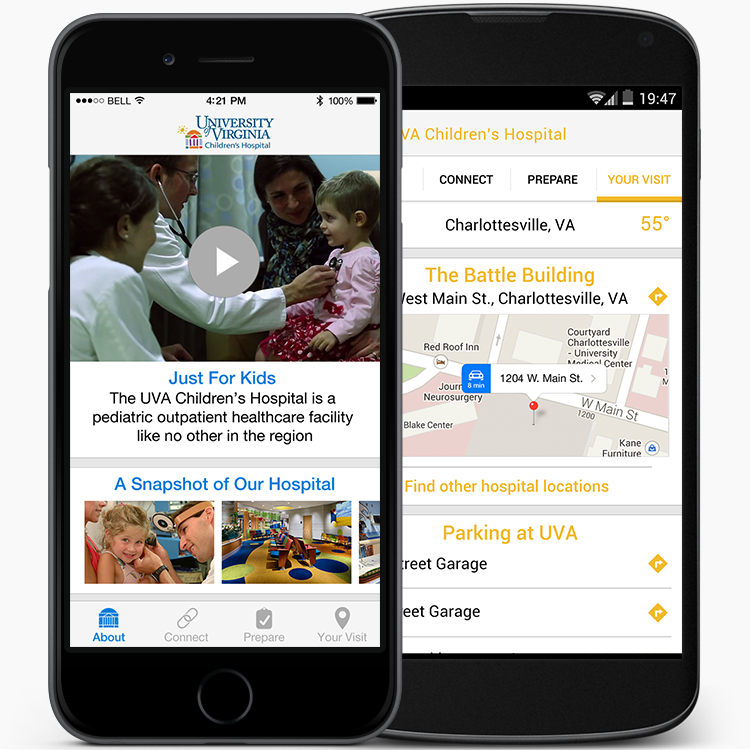
When a child is sick, parents are often frustrated trying to find essential healthcare information which only adds to the family's stress during a difficult situation. To ease the burden on parents and families trying to manage their child's health care needs, UVA Children’s Hospital asked WillowTree to create a mobile solution that would provide critical hospital information at all times.
The Challenge
To promote the grand opening of the hospital and help the first patients admitted into the hospital, the app needed to be designed and developed in a very short time frame.
Project Process
Brainstorming Session
To determine the features of the app, we gathered for an ideation session with the Health System's CIO, a group of pediatricians, the CEO of WillowTree, and myself. The goal was to have an app developed for the grand opening of the Battle Building at the Children's Hospital, which would occur in just six short months. During the brainstorming session, we discussed many options and features for the app including way-finding, symptom tracking, and a digital physicians directory. With a short timeline in mind, we decided to start simple and "unindividualized"; future versions and subsequent apps would be more personalized and interactive whereas this app would be only informational. The brainstorm session resulted in a mission statement for the app focusing on developing an iPhone and Android app that would give patients an idea of what to expect when they arrive at the hospital, promote the recently opened hospital, and more.
Product Map
Once the mission statement was created, we discussed the features needed to achieve the end-goal. With the list of possible features, I created a product map to categorize every feature and functionality that would be present in the app, while omitting features that were not core to the app or would increase the timeline. The group and I collaborated over the product map to refine the features, making sure to focus on the user and the goals we had in mind for the app as well as ensure all functionality would be feasible by the hospital and developers.
Wireframes
After the product map was finalized, I began wireframing. The wireframes represent every action, interaction, and animation present within the app. The user's flow is denoted by the arrows between the views to demonstrate how the user would navigate through the app. Side copy is added to explain additional functionality for the client and the developers alike.


Visual Designs
The Battle Building itself was painted in cheerful colors and had interactive play areas to keep the children engaged and comfortable during the stay. The color scheme for the app played on this energetic and positive vibe that the hospital embraced. Each section of the app varied in color, which created a fun and delightful user experience. Overall, the interface is simple and easy to use so parents will naturally understand how to use the app without struggling.
Development
To ease development, I created a style guide, sliced assets for multiple resolutions for iPhone and Android, and denoted all analytics tracking in a separate set of wireframes. Throughout the development cycle, I worked synergistically with the developers to ensure they understood the project, the user flow, and to ensure the app was developed to my design specs.
The Result
The app was launched a few weeks before the opening of the new children's hospital. It makes visits to the hospital less stressful and creates better outcomes for patients, parents, and caregivers. The partnership to create this app with UVA Health Systems led to two subsequent apps that were discussed during the initial brainstorming session. The apps are available for both iPhone and Android from iTunes App Store and the Google Play Store.

