About the Project
Project Summary
Due to multiple and inconsistent navigation methods throughout Express.com, users shopping online at Express were faced with complicated and counterintuitive experiences. I was tasked with designing a singular secondary navigation method that could be utilized across every category page on the website, in order to create a more consistent shopping experience.
The Challenge
The challenge was designing an AEM component that could be applicable to all categories of the website. It needed to be scalable depending on number of sub-categories available, and it had to be intuitive and helpful while navigating the site. Since it was created through AEM, there were technical limitations that had to be considered and discussed with the development team throughout the design process.
Project Process
Website Audit, A/B Test Findings, & Competitive Research
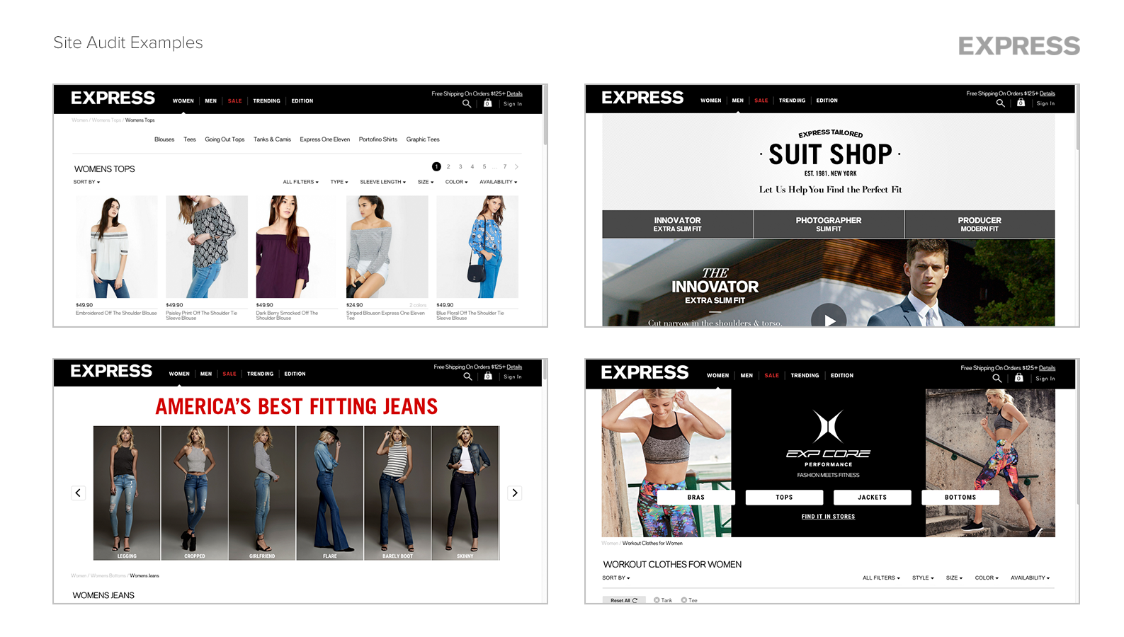
The category pages throughout the site had many differing forms of secondary navigation, such as visual navigation, tabbed navigation, multi-button navigation, etc. To understand all of the methods being used, I performed a website audit. The results of the audit revealed 14 varying navigation methods and of those 14, there were no consistent patterns when the user interacted with the component. The secondary navigation may have filtered the product results, it may have scrolled the user to an anchor on the page, or it may have taken the user to a detail page.
I also performed a competitive analysis to understand the interaction models and functionality competitors were utilizing for secondary navigation.
In addition to my own research, the site optimization team previously ran multiple A/B tests on the category pages which resulted in useful findings. The tests included findings such as shoppers tend to look at pictures for information rather than read text, users want to be able to jump to a specific type of fit quickly and easily, and including content at the top of the page helps SEO efforts and increases traffic to the relevant page . Analytics also showed that users that apply filters on a category page are much more likely to convert; for example, when women interacted with the visual navigation on the jeans page, there was an 108% conversion lift, and when men interacted with the visual navigation on the dress shirt page, there was a conversion lift of 150%. However, when women interacted with the text-based secondary navigation on the Women's Tops page, there was no impact on conversion. This data helped me to understand the performance of the current navigation methods and influence the design of the new secondary navigation.
Lo-Fidelity Prototypes
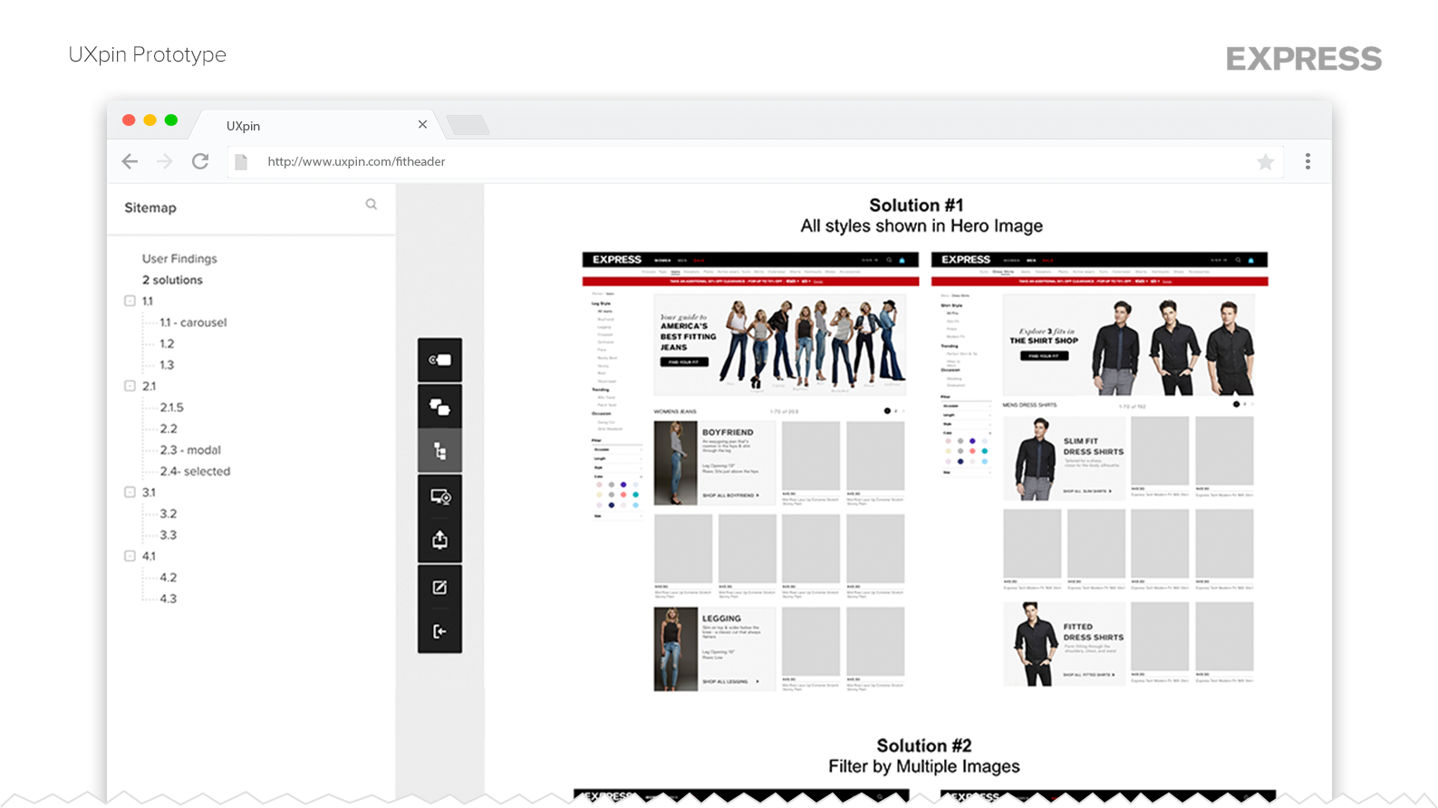
Reflecting on the research findings, I drafted two UX solutions for the secondary navigation which I then turned into clickable prototypes in UXpin. Using usertesting.com, I launched usability tests for each solution.
The main findings from usability tests were:
- Users want to browse and find products quickly and easily
- Users want to quickly understand all the fits being offered
- The secondary navigation needs to be intuitive with a clear call-to-action
With these additional findings, it was clear the solution which included a pop-up "Fit Guide" would be the best user experience. When discussing the findings with the project stakeholders and cross-functional partners, the development teamed voiced concern regarding technical restraints that had not been previously identified. In order to maintain our original timeline, we would not be able to provide a “Fit Guide” for each category.
With this information in mind, I revised the design and ran another user test, to ensure the secondary navigation would be a helpful experience without the fit guide. Instead of displaying all of the fit information in a pop-up modal, the user would link to a detail page to read the fit information. The users tested had a positive reaction to the revised navigation and found it helpful in finding the right fit or style they were shopping for.
Component Development
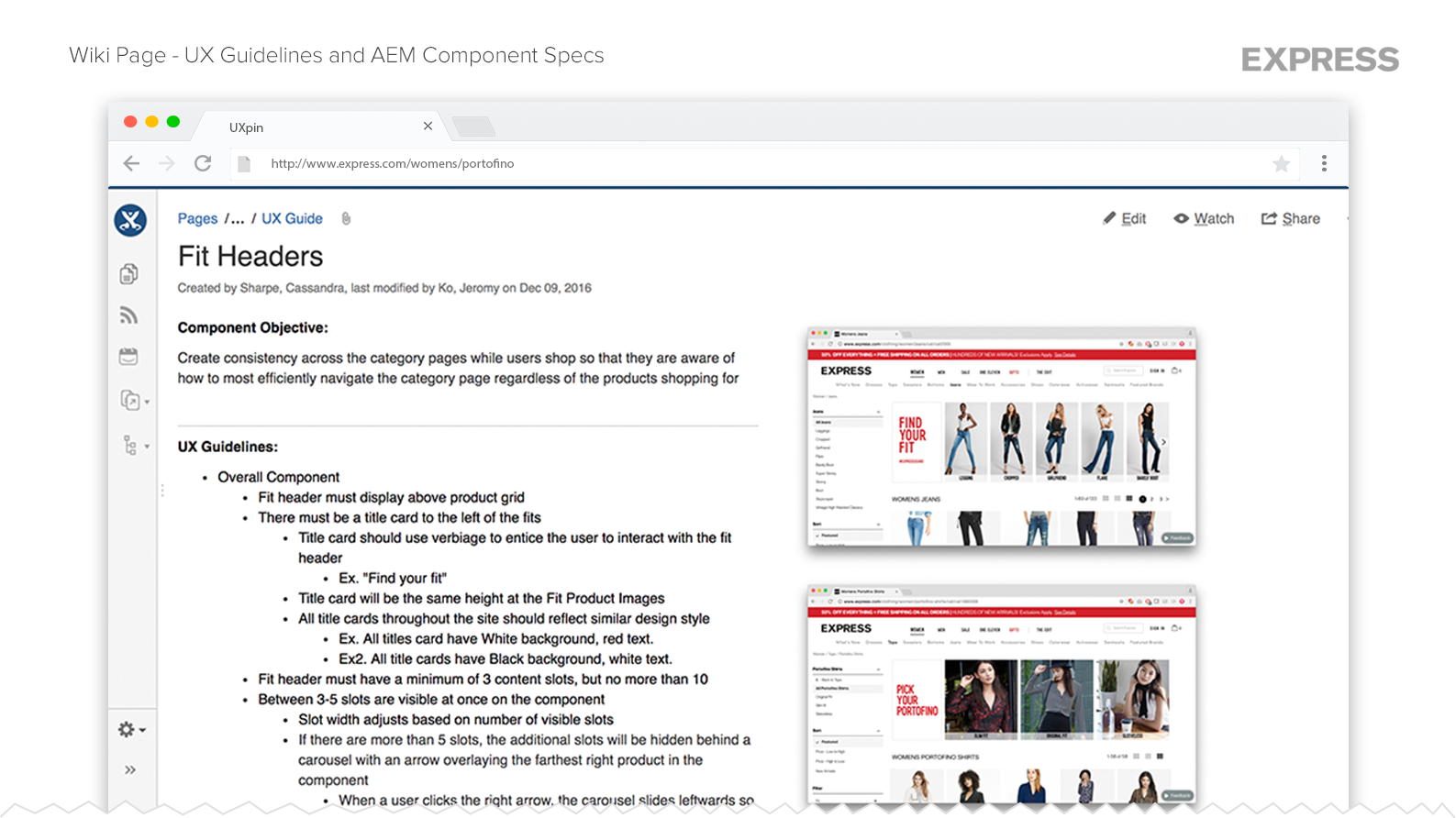
In order to guide the development of the component in AEM, I created a Wiki page stating UX Guidelines and Component Specs. The guideline states required interactions, conditional scenarios, layout placement, and specific size specifications for the component. I worked closely with the developers to confirm they understood these guidelines and to ensure the navigation was developed to the design specs.
The Result
The live "Fit Header" secondary navigation receives high usage, especially among men who prefer to navigate by images. Since launched, no additional visual navigation components have been created, thus giving the website a clean and consistent experience.


