About the Project
Project Summary
In 2015, the New York City Football Club was formed as the newest American professional soccer team in Major League Soccer. To set themselves apart from other MLS teams, NYCFC desired an app to allow their new fans to stay connected with live match scores and stats, the latest news, highlights, photos and much more. As lead designer on this project, I worked collaboratively with Matthew, a fellow UX Designer at WillowTree, as well as the client, project manager, and developers.
The Challenge
The challenge for this project was an extremely tight deadline; there were only six weeks from project kick off until the first game of the season. This meant a very short design phase, focused on using stock OS elements to allow the app to be developed and tested in a little over one month. In addition, the app integrated with the Major League Soccer API, which was still in development, leading to unforeseen complications for UX and development alike.
Project Process
Product Map
Since the project timeline was less than three months, there was no time to dedicate to user experience strategy so the client provided a list of pre-determined features. From this list, Matthew and I were able to determine every feature and functionality that would be present in the app and added a few features to create an engaging user experience. To stay organized and ensure all aspects were designed and developed, we created an in-depth product map with details to further define each feature.


Wireframes
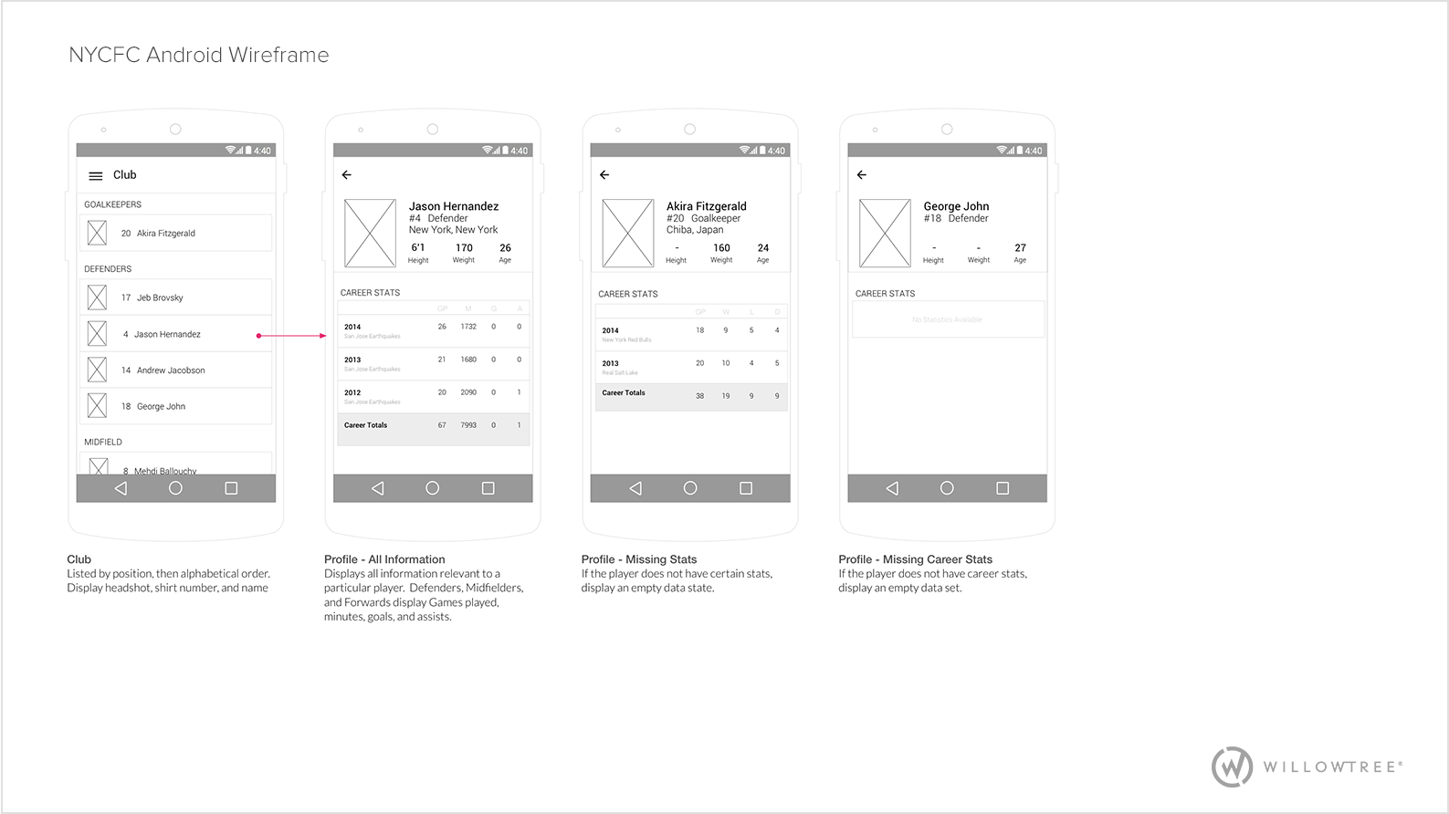
After the product map was finalized, we began wireframing. Although I focused on iPhone wireframes and Matthew on Android, we worked together to ensure the experience was similar on both platforms. When problems arose in the user experience, we sketched and brainstormed ideas until the best solution possible was discovered. The wireframes below illustrate how the iPhone and Android experiences differ as well demonstrate the UX for a few sections of the app.


Visual Designs
After a quick competitive analysis, Matthew and I agreed that the NYCFC app must behave and look different than most sports apps, as they tended to look generic and not have much personal branding. To engage as many users as possible, the app must be distinguishable, intuitive, and captivating.
Incorporating the team colors as well as large logos made the app very visually appealing. For the game matches view, an image of the home field will display with a blue gradient overlay. This creates a sense of delight as the user notices the change of background image from game to game as the location changes. The blue overlay continues to promote the team colors and make the app radiate in team spirit. The color orange is used carefully to indicate action or selection, pulling the users attention to important items and contrasting well with the primary color.
Development
During development, many of the expected elements of the API were missing. Instead of adjusting every design, this issue was communicated to the MLS API developers, who were able to adjust the API for most instances. In scenarios where adjusting the API would be too time consuming, I worked with the iOS and Android developers on the fly to adjust designs to match the API as well as communicate with the client the necessary UX changes.
The Result
Live in the stores on March 4th, the app was published just four days before the first game of the season. The app was promoted on the team's website, advertisements, and news articles. Currently, the app has five star ratings in both the App Store and the Google Play Store with great reviews complimenting the UX and UI such as "Simple and Slick. All the info you need in one place. Fully functional and easy to navigate" and "Clean, well-designed, easy to navigate, and stable. Those are the must-haves for a sports team app and this one hits them all."

