About the Project
Project Summary
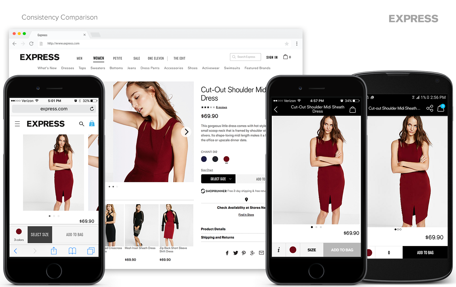
Due to the absence of a comprehensive style guide and many UX/UI designers working on the company’s website and apps, the digital shopping experience and interface had become very inconsistent. This inconsistency created three main issues for the users and eCommerce team:
- 1. The inconsistency disoriented users; having to think before taking action which would lead to frustration and abandoned purchases.
- 2. Without a clear style guide, each designer had to re-think their visual design for every project, leading to wasted time and increased inconsistencies throughout the digital experience.
- 3. Due to unpredictable visual designs, the development team was unable to create a component library of recyclable code, resulting in increased workload and time spent on each project.
Recognizing these issues, I determined that we needed to create a UX/UI styleguide defining each component used throughout the digital experience. By doing so, each project would be designed more efficiently allowing the developers to have a reusable library from which they could pull components and code, resulting in faster development. In turn, the users would intuitively understand the interface and enjoy the digital shopping experience offered by Express.
The Challenge
With an extensive adaptive website, an iOS app, and an Android app, there were many visual elements and UX patterns to consider when attempting to create consistency across all platforms. The goal was to eliminate inconsistencies and create a style that would be constant for the website and apps alike, meanwhile keeping in mind modern web design best practices to create a better user experience.
Project Process
Multi-Channel UX/UI Audit
In order to fully understand the inconsistencies of the existing interfaces, I completed a visual audit of the desktop and mobile websites, as well as the iOS and Android apps. Throughout the visual audit, I took screenshots of each unique screen per platform. Once completed, I printed and grouped the screenshots by screen type (i.e. homepage, category page, product page, etc.), and displayed them on the wall. Using the printing screenshots as my reference, I crafted a list of all the elements that needed to be defined.
Team Workshops
With the screenshots of the digital shopping experience hung around us, the team and I were able to see all the views at once, giving us a greater understanding of all the elements that would be affected by the redesign.
Some of the initial elements we set out to define were headers, body copy, drop downs, links and button treatment. We decided the best approach would be to move from one element to the next. With highlighters and markers, we circled the element being discussed on each printed screenshot and began crafting solutions for the element.
For example, the first element we defined was Header 1. On each screen that Header 1 was or should have been displayed, we circled it. Then, I pulled up pages of the current website that displayed the header. Using the inspector tool, I altered the CSS of the header with potential solutions. When the best treatment was unclear or uncertain, we would sketch we would sketch, brainstorm new ideas, research best practices, and cross-reference competitor sites. After finding the potential solution, I altered the CSS of multiple pages with the H1 solution to ensure it would work across all channels. Noting the soltuoin, we then moved onto the next element to be defined. As we established styles, we kept in mind web accessibility and checked for color contrast whenever relevant.
Visual Design
Once the workshops were complete, I mocked up a few specific views that reflected the majority of the design changes. This would allow us see the changes holistically and reinforce the decisions made.
In addition to the mock ups, I created a comprehensive UI Library template in Sketch. By using symbols and text styles, each designer now has a foundation on which they can start a new project and ensure they are adhering to the style guide.
Development Integration
We met with the development team to discuss the proper method for implementing our new style and consistency. Due to the team's workload and priorities, it was determined that the changes would not be its own project, but rather slowly integrated into existing relevant projects. I collaborated with a business analyst to write tickets for each element, noting the proper styling, expected interaction, and impacted locations. We also provided a link to the UI Library template in Zeplin for the developers to reference.
Conclusion
The development team has started integrating the new stlying into their current projects. The creative art director is also producing a thorough online style guide for anyone at Express to access: including detailed design specs, design use cases, and CSS for each element. All involved with this project have agreed that having a consistent style will create quicker project turn-around and help us achieve an established visual look with a more intuitive user experience.


